
Branding & packaging
Good product. Quiet stall.
You put everything into what you sell. Can a stranger see that from six feet away?

Concept illustration above: AI-generated for this article.
LOOK AT THE MIDDLE STALL.
The seller in the middle might have the best drink at the market.
We don’t know. Neither do the people walking past.
There’s no name to remember. No label telling them what’s in the bottle. No clear reason to stop. So the seller has to explain everything, one person at a time—if anyone gives them the chance.
The neighboring stalls have already started that conversation. Their signs, packaging and displays give people something to recognize, understand and ask about.
That is one of branding’s most practical jobs: helping a stranger take the next step.
A SMALL EXPERIMENT
Same bottle.
Different introduction.
Switch the presentation. Notice how much less you have to guess.
A LOT LEFT UNSAID
“What am I looking at?”
A bottle and a handwritten word. You still need to ask what it is, what flavor it is, and who makes it.
Illustrative packaging concept, not a client project or a prediction of sales.
A logo can’t do
all the talking.
A logo gives you a signature. The rest of the brand gives that signature meaning.
Think about the things a shopper needs to work out: What is this? Is it for me? What makes it different? How much does it cost? Where do I buy it again?
The name, words, colors, photos, labels and buying experience should help answer those questions together. If the booth feels playful but the website reads like a legal form, the customer has to figure out whether they’ve found the same business.
Make the good in your product
easier to see.
Professional doesn’t have to mean expensive, formal or stripped of personality. A bright lemonade stand can look professional. So can a handwritten bakery label. What matters is whether the choices feel intentional and the information is easy to use.
FROM THE STUDIO
Here’s what that looks like
off the drawing board.
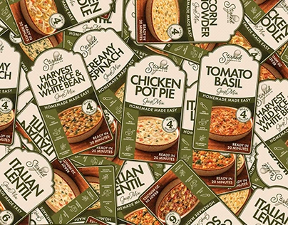
Different products need room for their own identities. A shared label system gives them a family resemblance, so the next item can feel familiar without looking identical.
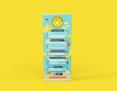
At a market, the display has to work before the conversation starts. A menu and banner are working parts of the brand: they help a passerby spot the offer and decide what to ask for.
Portfolio images and projects: Jessica Trimm / URGrafix, via Behance. These examples illustrate design choices; no sales results are claimed.
Don’t blame every slow day
on the label.
The drawing makes the difference look simple. Real sales are messier.
Price, product quality, location, demand and service all matter. A beautiful package won’t fix a drink nobody likes. And a crowded booth is not proof that its logo caused the crowd.
But if people keep walking past without understanding what you offer, presentation is worth examining. Your product can’t make its case until someone notices it.
YOUR TURN · A TWO-MINUTE CHECK
Step outside
your own business.
Open your website, put a product on the table, or look at a photo of your booth. Check only what a new customer could honestly say yes to.
Start with a stranger’s view. Check each statement that holds up.
START SMALL. MAKE IT CONNECT.
You don’t need to rebuild
everything by Monday.
Fix the first point of confusion. Make the product name readable. Explain what’s inside. Use one clear set of colors and type across the places customers see you. Then carry those decisions through.
The goal is a business people can understand, recognize and return to.
Give your product a fair introduction.
Then let it earn the repeat visit.